Chaos Begins
Branding
2023


Building More Than a Gym. Fitness Saga was created to redefine what a modern fitness brand can look and feel like. Rather than positioning itself as simply another gym, the identity was built around movement, discipline, and personal transformation. Every visual element—from the logo to the environmental graphics—was designed to reinforce motivation while creating a bold and memorable brand experience.
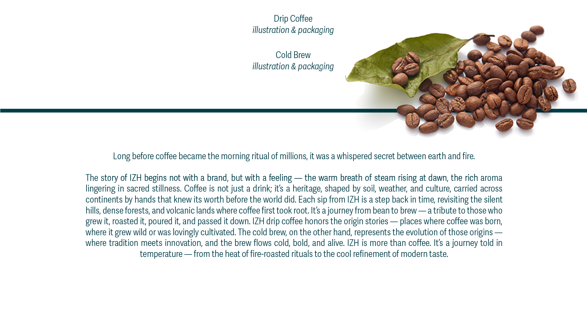
Introducing drip coffee to a market where the brewing method is still relatively unfamiliar meant the design had to educate as much as it inspired. The identity needed to distinguish IZH from conventional instant coffee while clearly expressing the convenience, craftsmanship, and premium quality behind every cup.
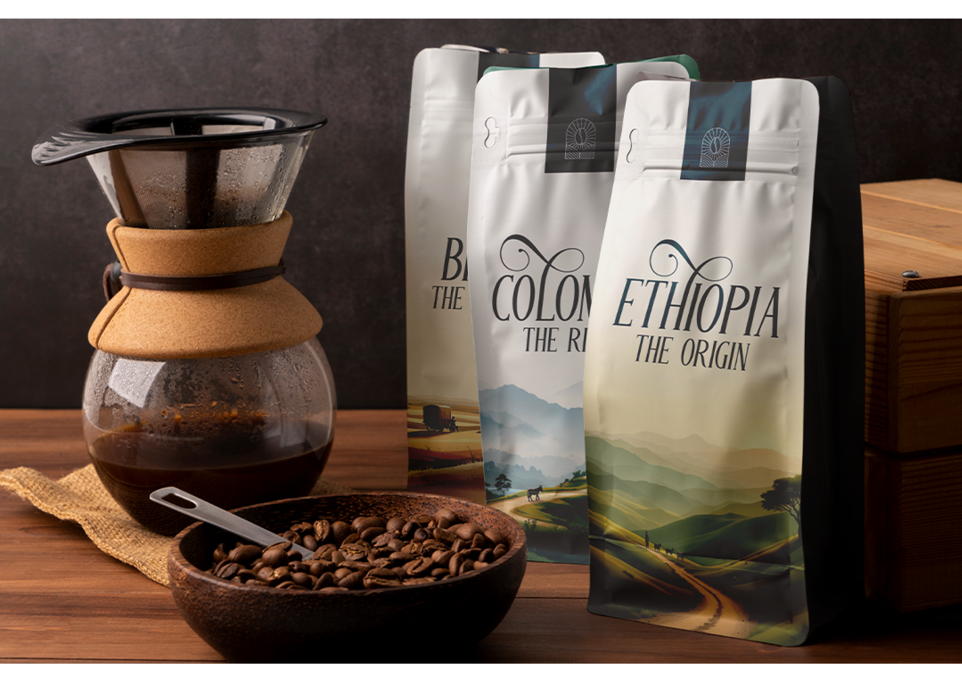
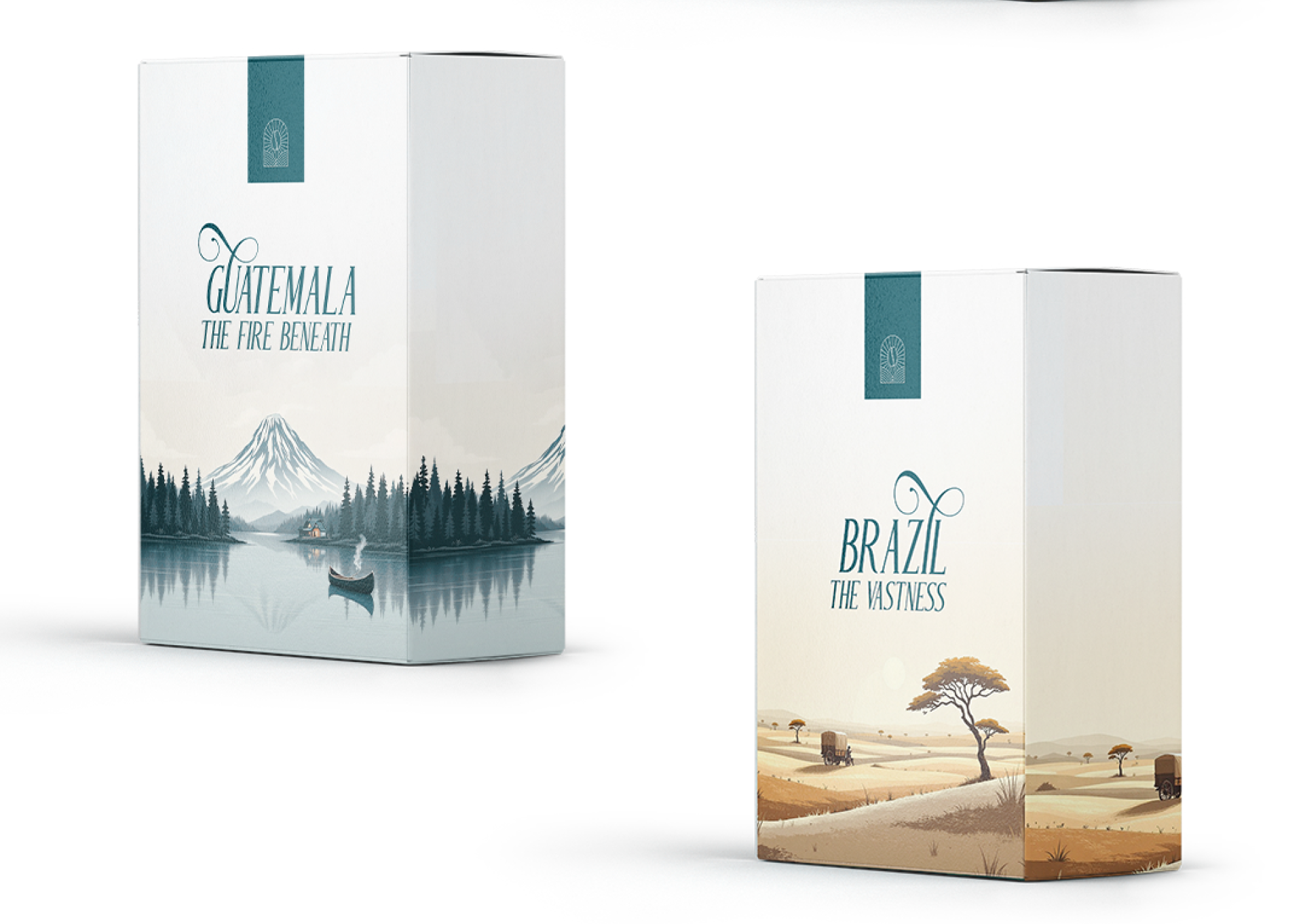
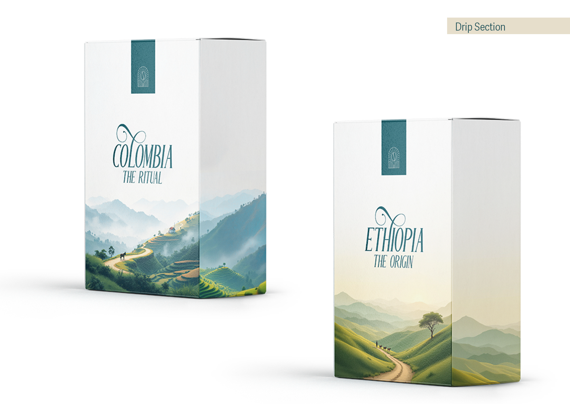
At the same time, the packaging had to remain clean, memorable, and easily recognizable across multiple product variants.
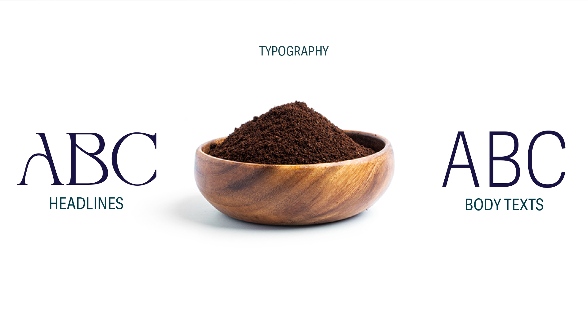
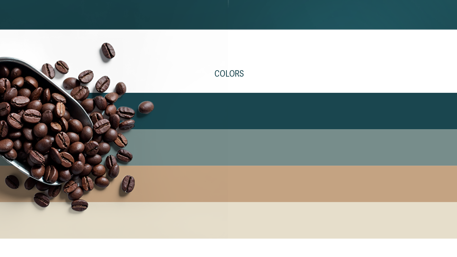
The visual system was built around minimalism, clarity, and contemporary aesthetics. Clean typography, structured layouts, and a refined color palette create a premium shelf presence while allowing the product itself to become the focal point.
Every design decision was made to simplify the customer journey—from first impression to first brew—making the experience feel approachable without compromising the perception of specialty coffee.