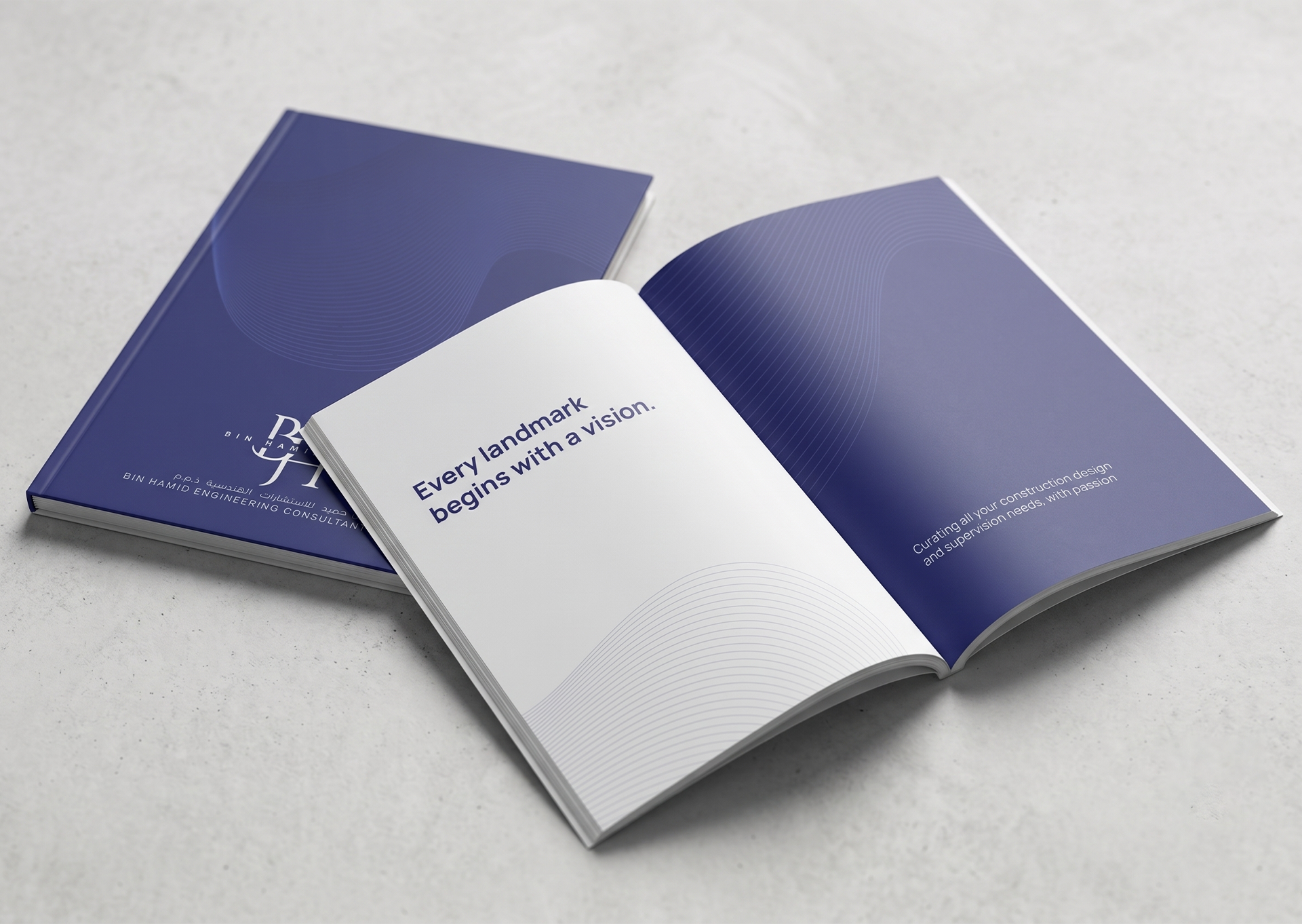
BIN HAMID ENGINEERING CONSULTANT
Company Profile
2026


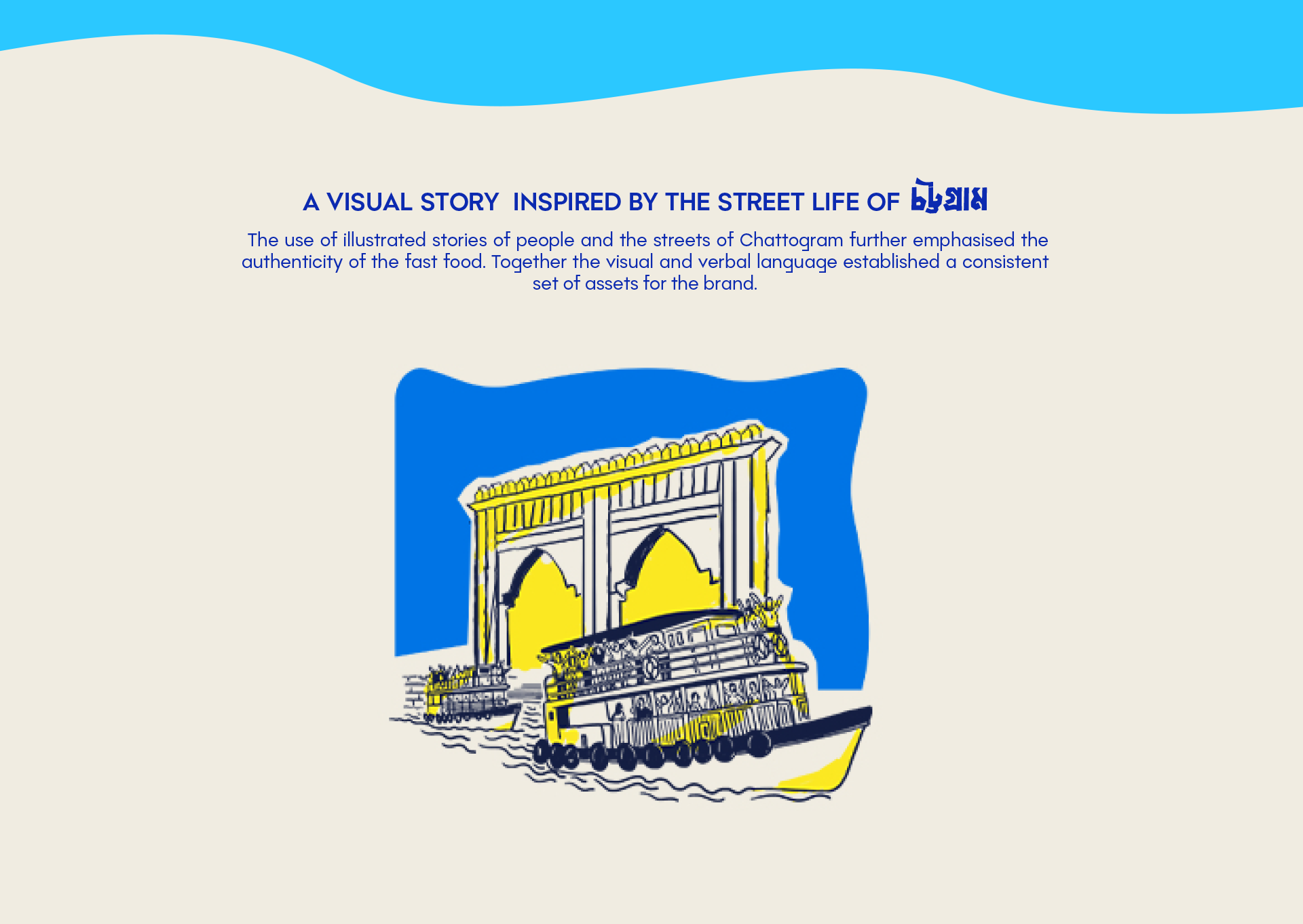
Chaos was created for people constantly on the move. Inspired by the fast-paced lifestyle of Chattogram, the brand embraces the energy, unpredictability, and everyday hustle that define the city's culture. The name itself reflects this idea—transforming the "chaos" of daily life into a memorable and relatable brand experience. The objective was to create a bold identity that speaks directly to modern Chatgaiyyas, positioning fast food as the perfect companion to their fast-moving routines.
The challenge was to design a fast-food brand that felt deeply rooted in local culture rather than following familiar global fast-food aesthetics. Instead of relying on generic visual trends, the identity needed to capture the unique rhythm of Chattogram—its busy streets, constant movement, and vibrant urban energy—while remaining simple, memorable, and highly adaptable across every customer touchpoint.
Design Highlights: Brand strategy rooted in Chattogram's urban culture. Identity inspired by the city's fast-paced lifestyle. Bold typography and expressive graphic system. Packaging, menus, and takeaway experience. Flexible branding across digital and physical touchpoints. Distinctive visual language built around movement and energy.
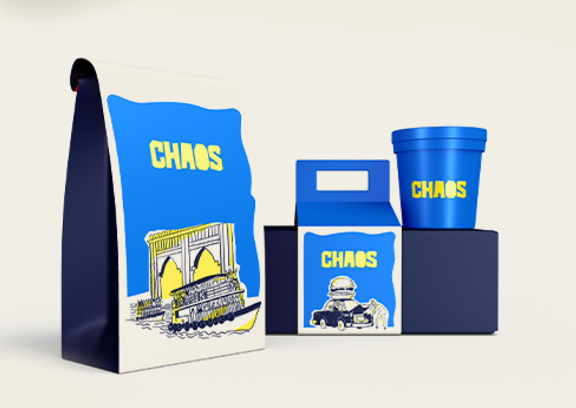
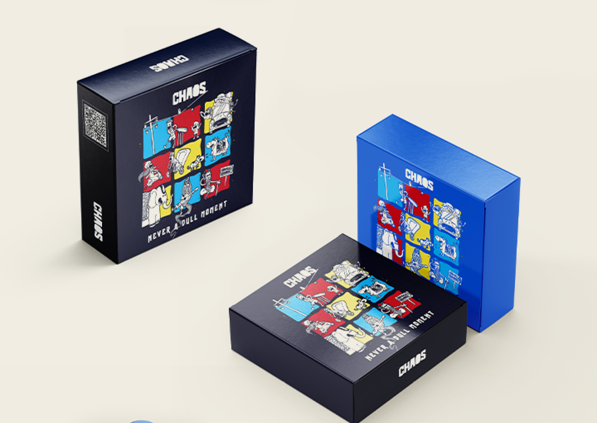
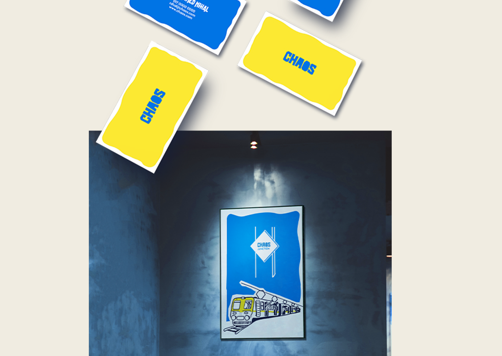
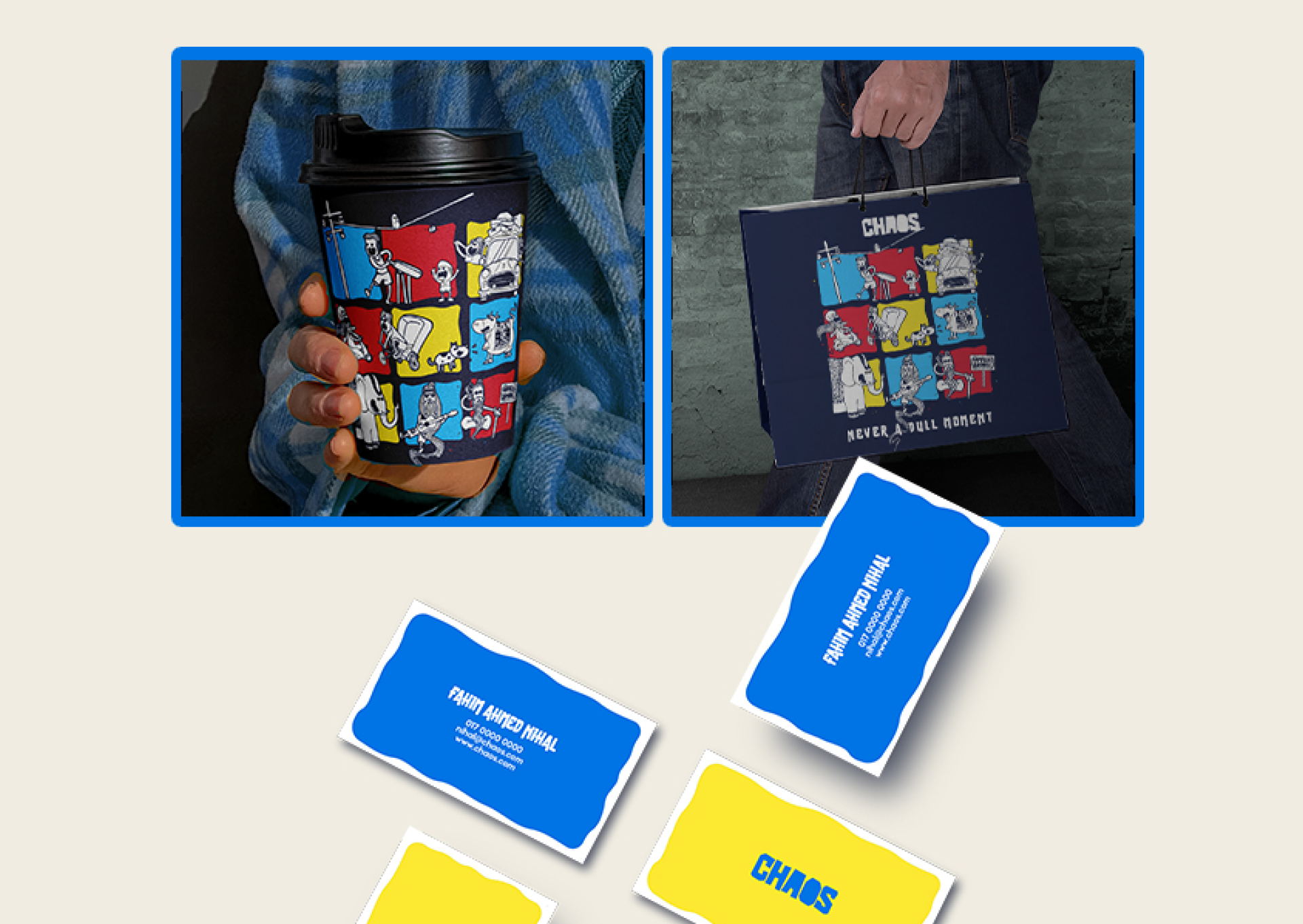
The visual identity draws inspiration from the city's dynamic pace, translating movement and controlled disorder into a cohesive design language. Bold typography, energetic layouts, expressive graphic elements, and high-contrast colors work together to create a system that feels lively without sacrificing clarity. Every element—from packaging and menus to social media and environmental graphics—was designed to reinforce the brand's connection to the city's everyday rhythm, creating an identity that feels unmistakably local while remaining contemporary.
Every application, from packaging to retail boxes, was designed to keep that same loud, warm, slightly ungovernable energy — never smoothed out to feel corporate.



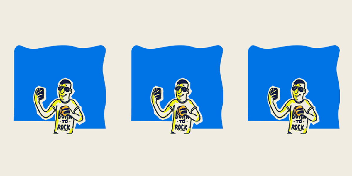
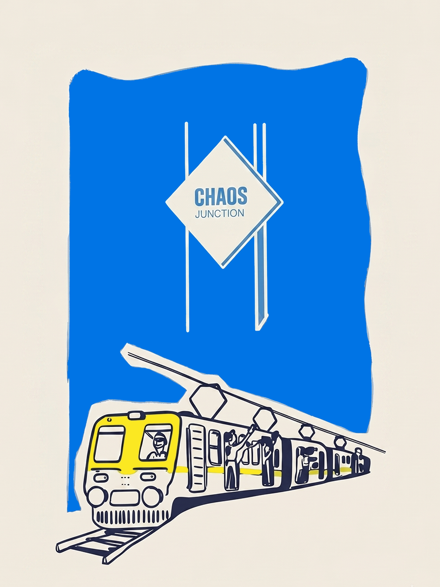
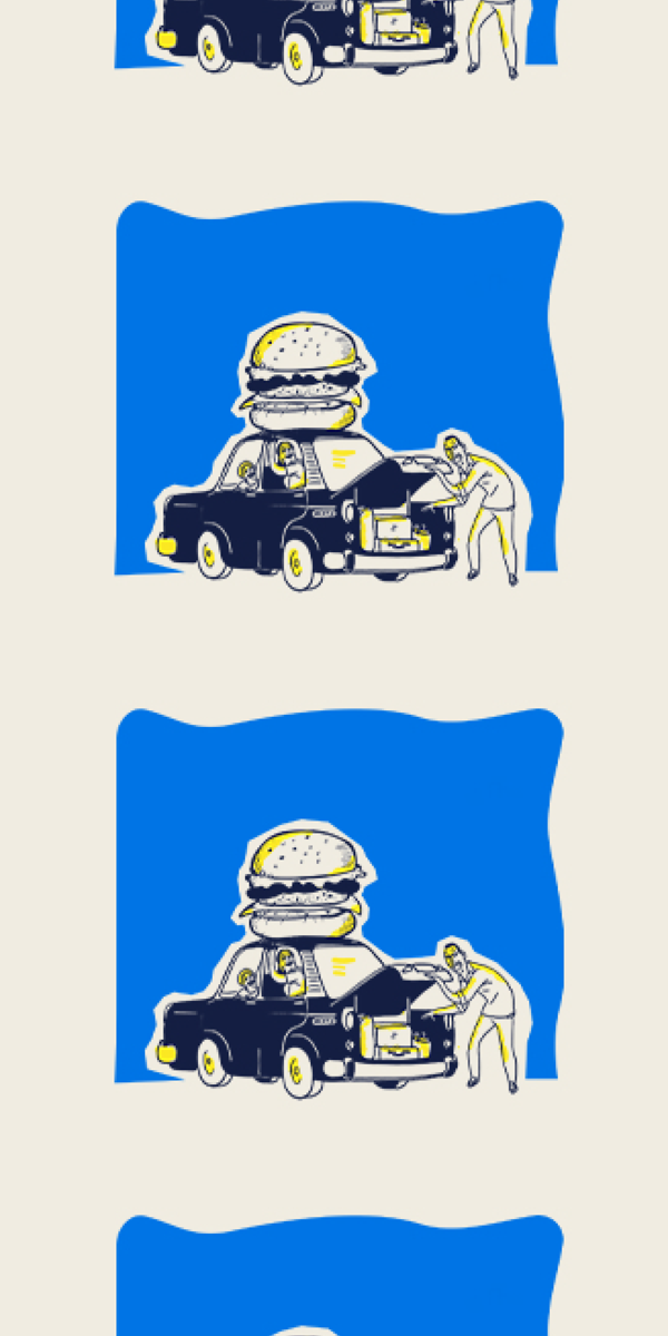

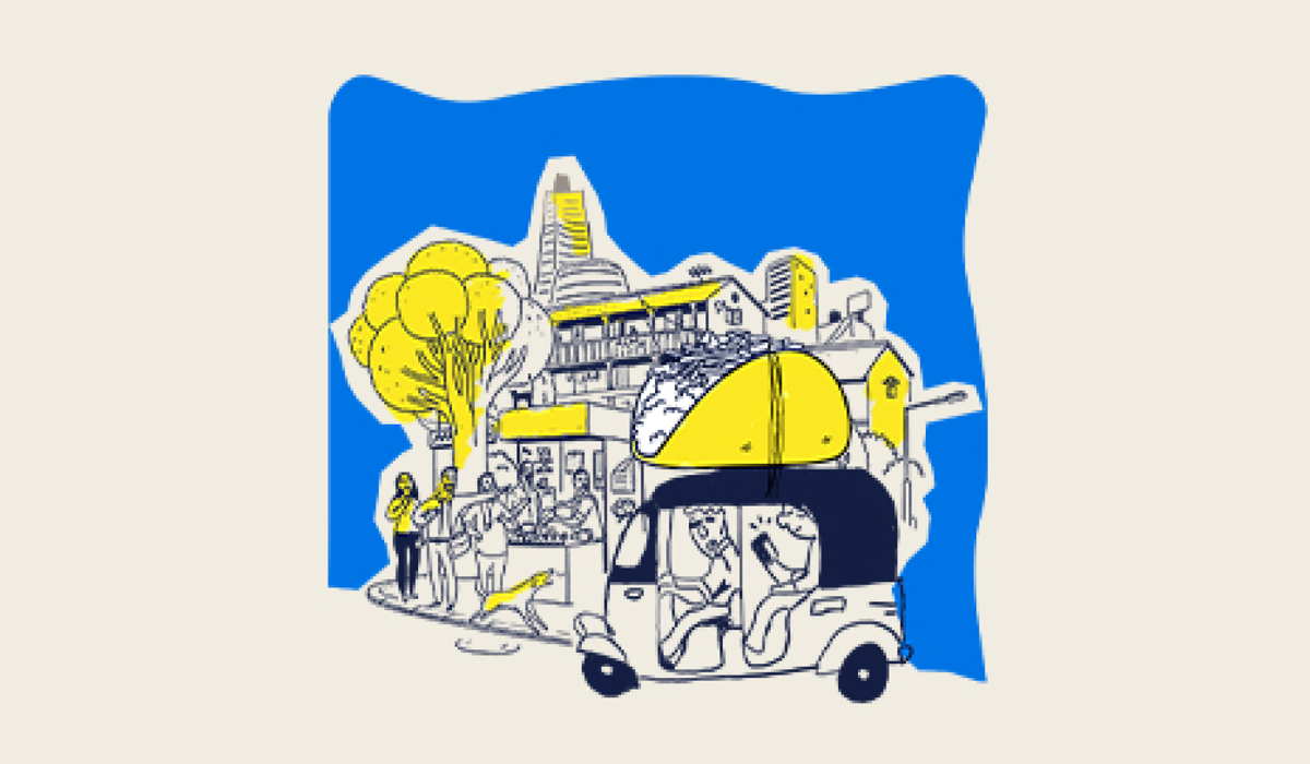
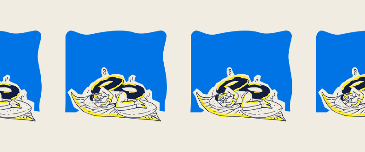
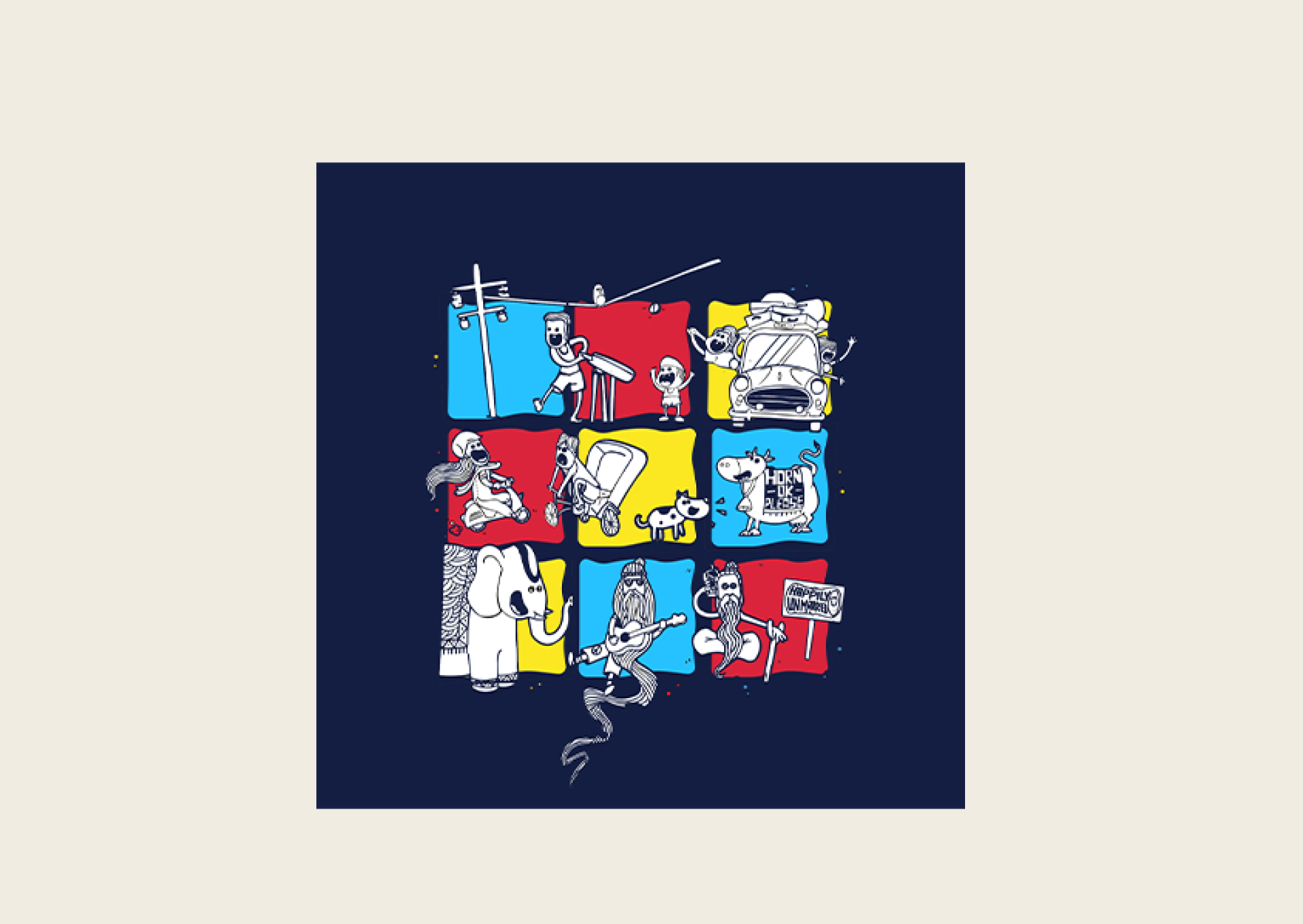
Chaos successfully transforms the everyday pace of Chattogram into a recognizable brand experience. Rather than simply selling fast food, the identity celebrates the lifestyle of its audience—people navigating busy schedules, crowded streets, and constant movement.
The result is a culturally grounded brand that feels authentic to its community while standing out through a confident, memorable, and scalable visual identity.