Chaos Begins
Branding


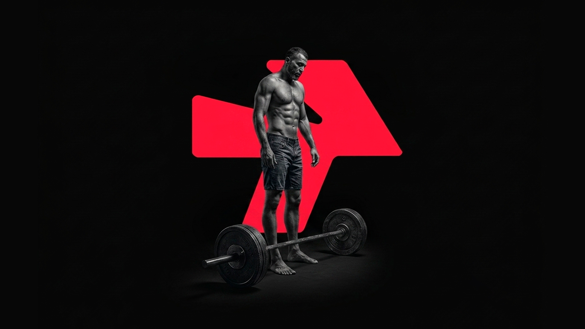
Fitness Saga is a fitness sub-brand built for Epic Properties, designed to feel like its own destination rather than an amenity bolted onto a building. The identity is built around momentum — visual language shaped by movement, discipline, and transformation, translated into a system that holds up from a small logo mark to a full wall of environmental graphics.
Epic Properties was adding a fitness facility to its property portfolio, but didn't want it to read as "just another gym" bolted onto a building. It needed its own identity — one built for movement, discipline, and transformation — while still feeling like it belonged to the same family of Epic Properties spaces members already trusted.
The brief: give Fitness Saga a visual language strong enough to stand alone, flexible enough to live across signage, uniforms, and interior graphics, and disciplined enough not to compete with the architecture around it.
The identity is built around a single idea: momentum. The wordmark leans forward, the color system pulls from high-energy contrast rather than the muted tones typical of corporate gym branding, and the supporting graphic language was designed to work as large-scale environmental branding first — logos second.
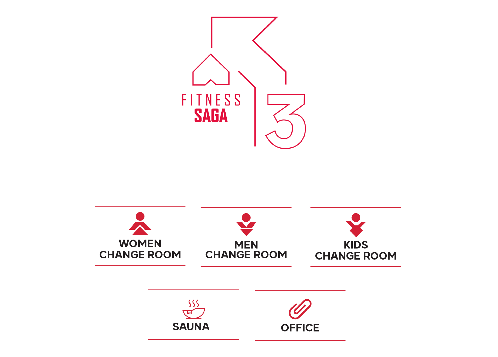
Every application, from wall graphics to signage, was designed to be read at speed — glanced at mid-workout, not studied up close.
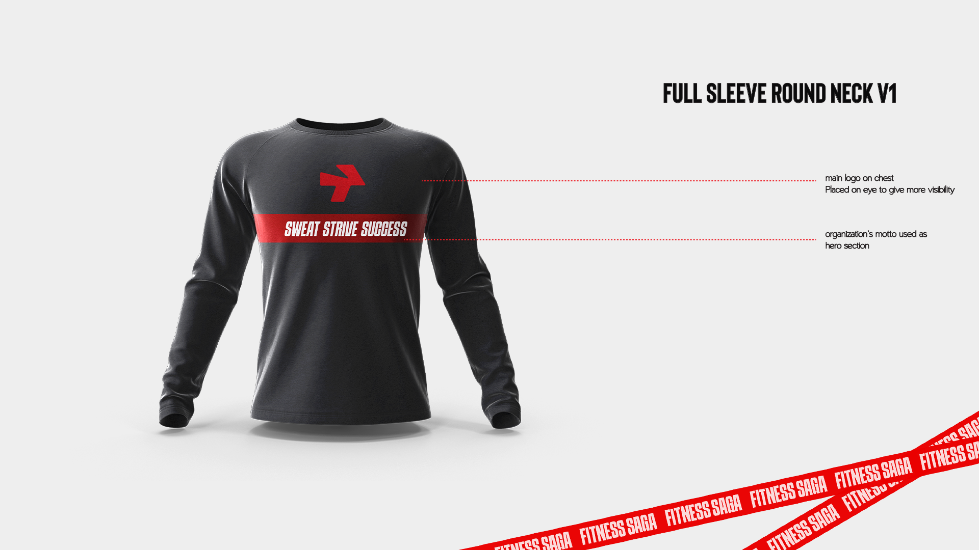
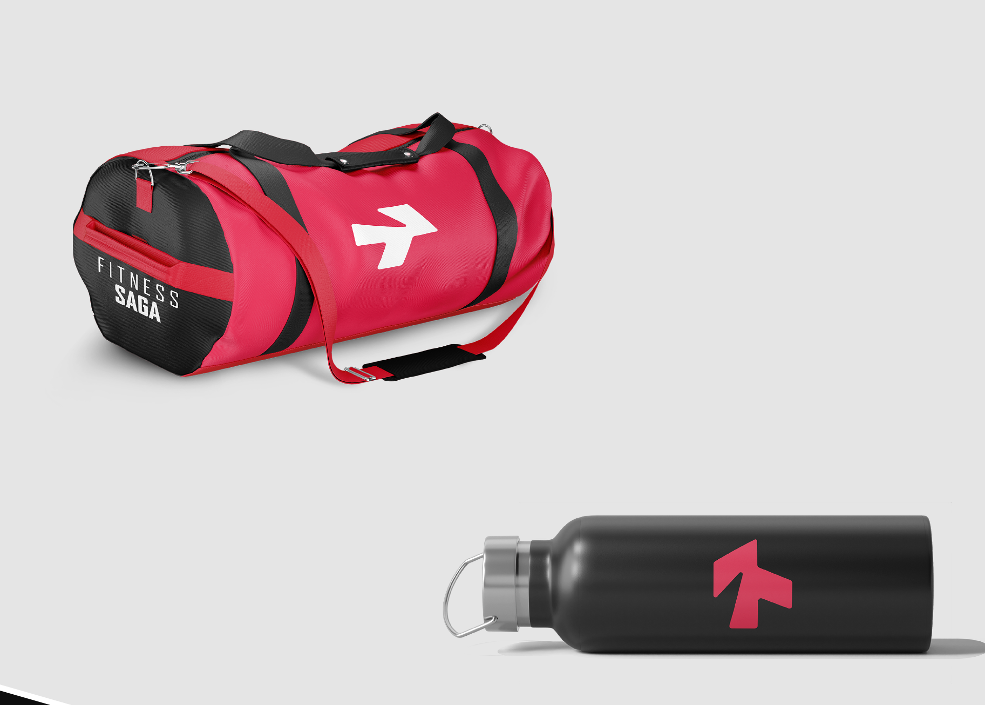
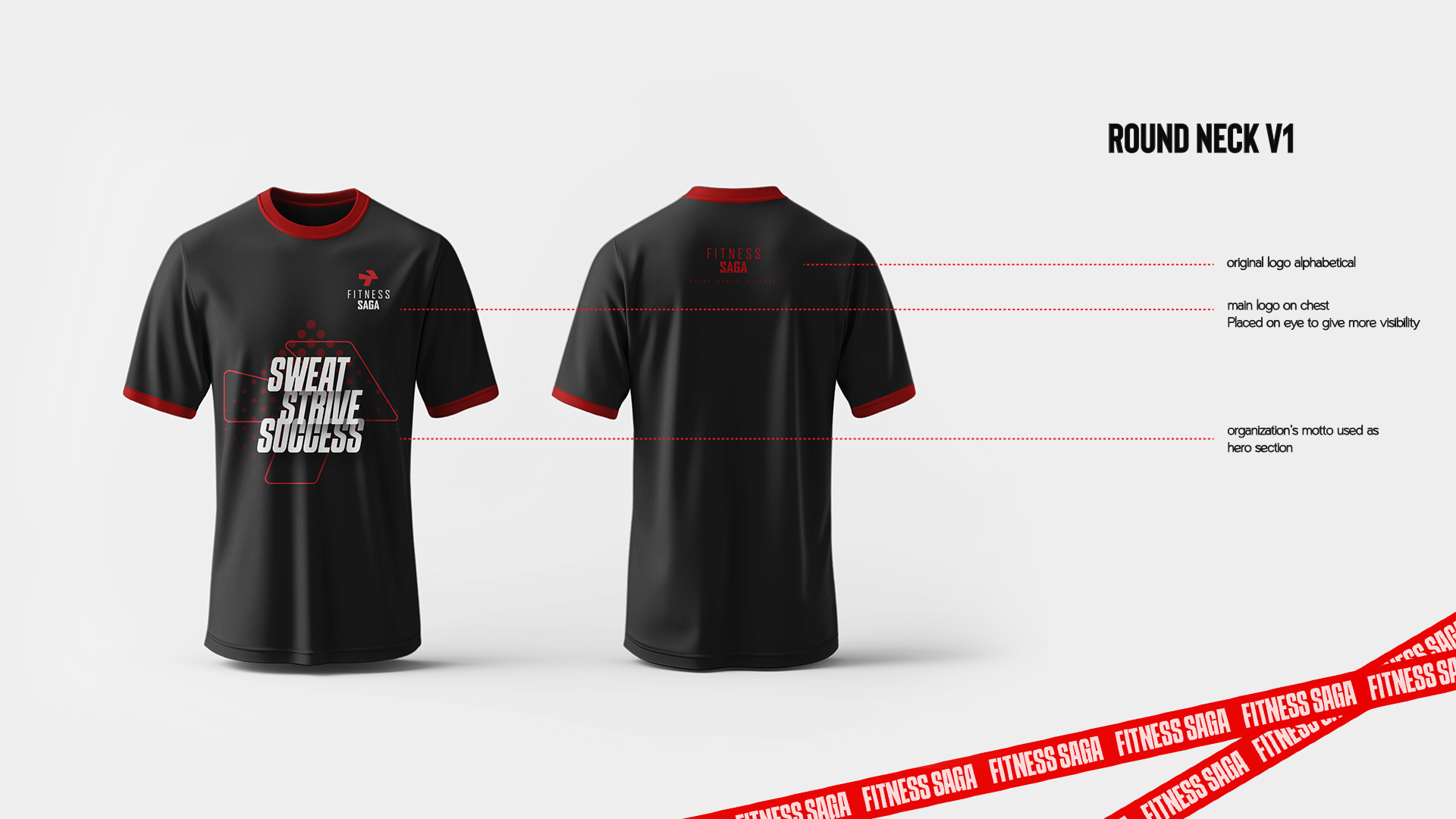
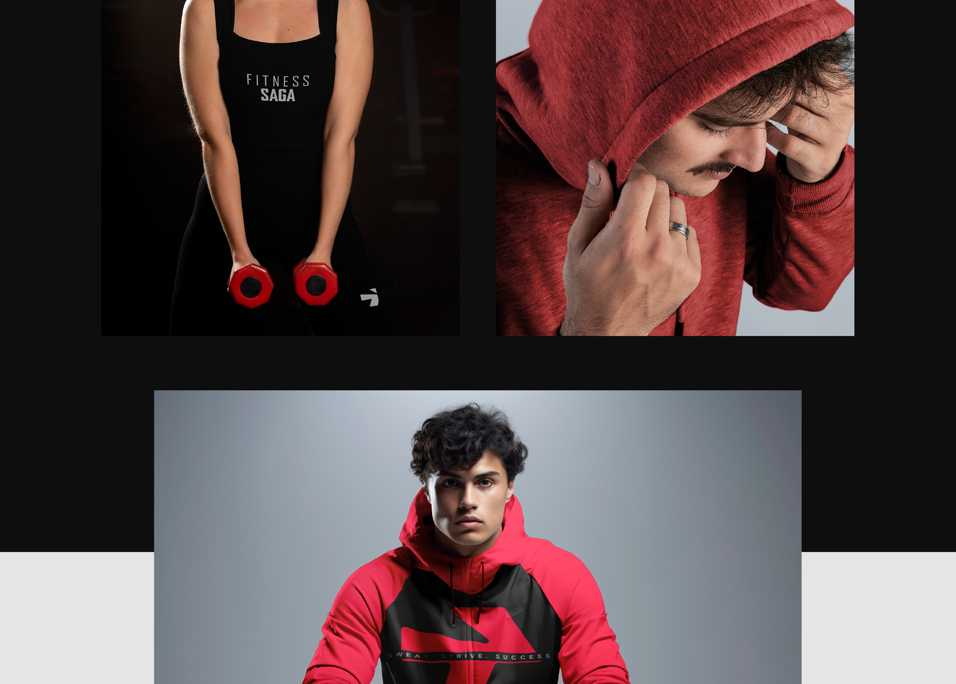
Every touchpoint, from physical merchandise to large-scale environmental graphics, was designed to keep visual energy high and maintain the brand's fast-moving identity.